|
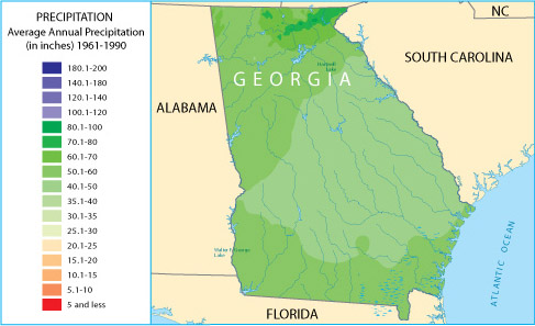
Weather mapsWeather maps show a variety of conditions. For example, some portray the amount of precipitation an area receives. Others show the average minimum and maximum temperatures. Figure 2.2.8 shows the average annual precipitation for the state of Georgia. Figure 2.2.9 shows the average annual precipitation for Colorado. Compare the two maps. Do you see that most of Georgia is much wetter than Colorado? However, notice that certain areas of Colorado receive as much rain as Georgia.
If your doctor recommended that you live in an area that is very dry, which of the two states would you chose? What if you wanted to farm but you did not want to have to irrigate (water) the crops? Which state would you chose? As you can see, a precipitation map provides much of the information we would need to make these judgments. With access to weather maps, it is not necessary for you to visit Colorado or Georgia in order to get a pretty good idea of which areas would be better for some things than others.  
|
About Us | Terms of Use | Contact Us | Partner with Us | Press Release | Sitemap | Disclaimer | Privacy Policy
©1999-2011 OpenLearningWorld . com - All Rights Reserved


